Phase 2 Designs
Phase two designs were more fun than the previous phases because I felt like I had more freedom. That being said, working larger makes it difficult to keep all the text within the grid.


Designers in History
Max Huber
Max Huber was a Swiss designer who helped lay the foundation of the Swiss school of graphic design, aka the type rules that we still learn today. Throughout his career he balanced his time as a freelancer and saving time for his experiments as he continued to create innovative designs. In his layouts he favored clarity, rhythm and synthesis placing a particular emphasis on hierarchy. His designs often explored photos and texts interwoven with blocks of bright colors.


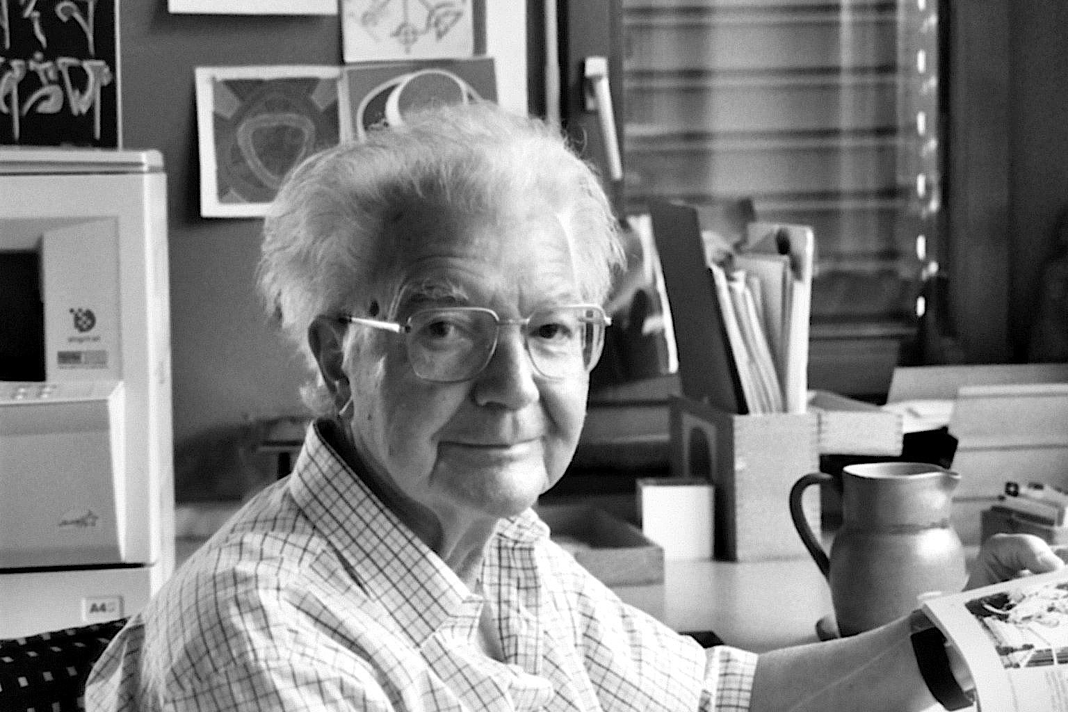
Bruno Monguzzi
Bruno Monguzzi, another Swiss designer studied in both Switzerland and London. He began working in the design field in the early 60's, helping to shape some of the design of that time. He worked for Studio Bogorri, a famous European design firm, and ended up marrying the daughter of the owner. He lived by his axiom "form follows function." He spend a lot of his carreer designing posters and other typographic layouts all over Europe and eventually began teaching about typography in Lugano. He has won numerous awards for his designs as well as his educational work.


Emil Ruder
Emil Ruder, yet another Swiss designer, and worked with other notable designers to establish the Basel School of Design and played a key role in design in the 40s and 50s. He along with several others, including Armin Hofman, helped to formulate the Swiss design styles. Ruder taught that typographies main goal was to communicate ideas. He stressed the use of san-serif fonts and a clear concise style. He also placed an emphasis on the grid and an asymmetric style which is still used today. Ruder also wrote several books on type.


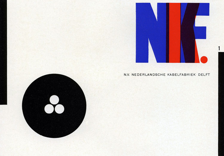
Piet Zwart
Another European designer, Piet Zwart also lead the charge in the modern type world. He believed that work that was done purely for the aesthetic would not stand the test of time, so he incorporated contemporary themes into his work. His work in particular contain constructivist inspirations. He like many other European designers, he designed on the grid and focused on asymmetrical styles. At the beginning of World War II, he was captured by the Germans. After being released he converted to mostly interior and furniture design.


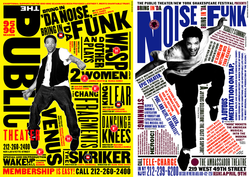
Paula Scher
Paula Scher is a designer stationed in New York. Her works focus predominately on environmental design with an emphasis in type. Scher makes type larger than life, while still conveying legible messages. She studied at Corcoran College of Art and Design and recieved the AIGA medal 2001.


Jessica Welsh
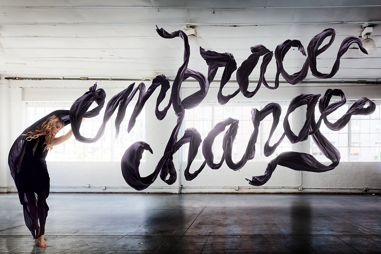
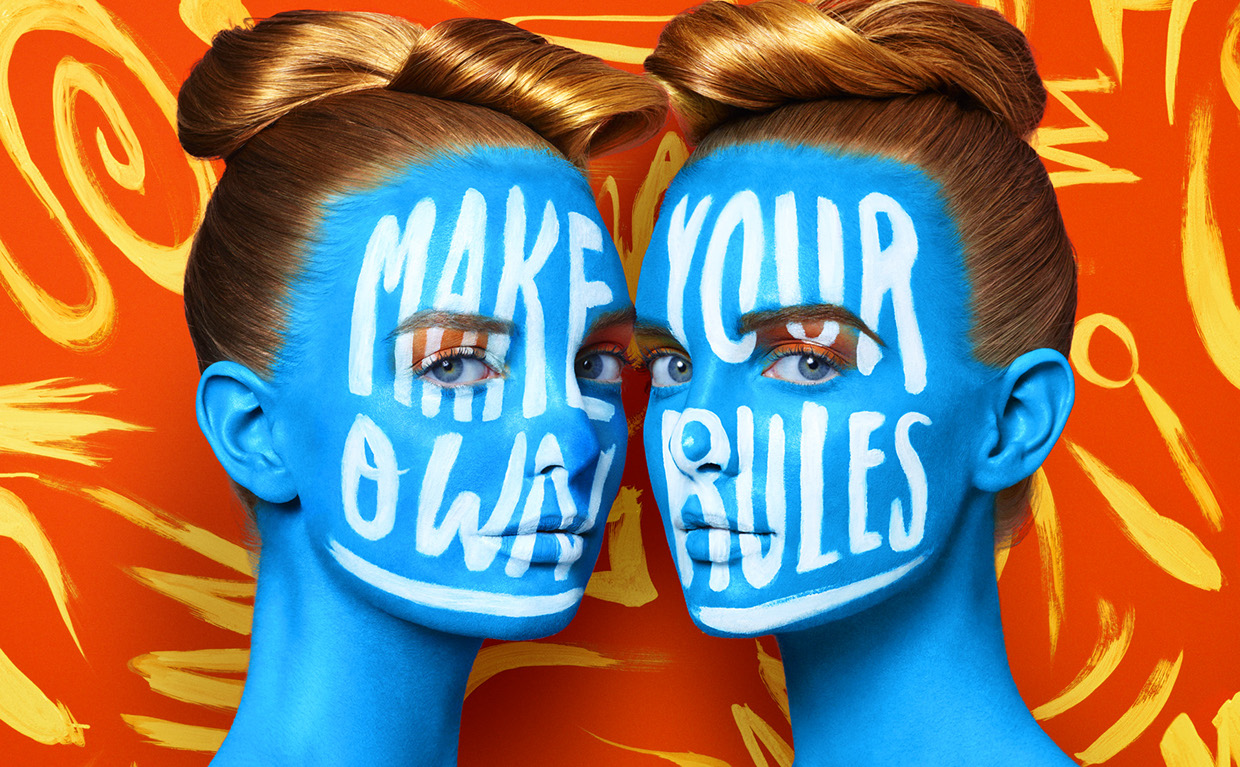
Another designer based in New York, one of Forbe's 30 under 30, works on daring modern designs that include type. She has designed for clients like the New York Times, and Adobe, and currently teaches at the School of Visual Arts in NYC. She recently partnered with Sagmeister and they run a very excentric firm together.
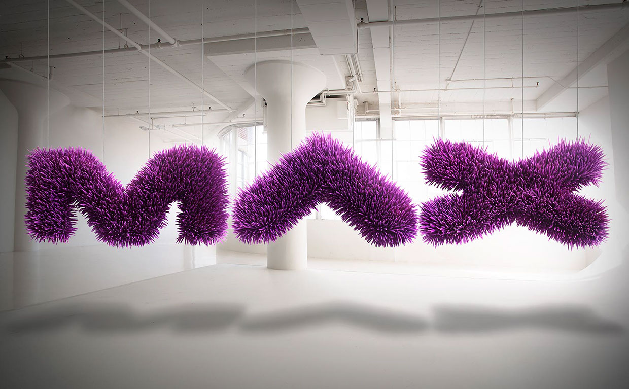 |
| THIS IS MADE OUT OF PENCILS! |
 |