
Tuesday, January 26, 2016
History of Design
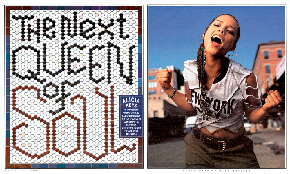
Fred Woodard

Woodward was most noted for his designs for Rolling Stone Magazine. He was respectful of graphic design history but he also added his own original features like the Oxford Border. He was known for letting the photo speak for itself, adding minimal text or none at all. In 1996 he was inducted into the art director hall of fame.

Gail Anderson

Also a designer for Rolling stone Magazine, Anderson was known for her typographic displays. She was known for her use of quirky or none traditional materials for her typographic displays that had great connections to the subject they were displaying. She was known and loved for her dramatic and comic designs and has written several books about her designs.

Tibor Kalman

Tibor was known for his daring and bold coverage of controversial topics at the time like AIDS. His magazine covers and spreads were often striking, just like their subjects. He embraced unsophisticated designs, a division between Modernism and postmodernism, which strikingly represented his subjects.

Alexi Brodovitch

Brodovitch was most famous for his work as the art director of Harper's Bazaar. He made huge changes in magazine design as he had complete creative freedom. He was known for daring type placement of type and images, making design more asymmetrical and interesting than people were used to at the time.

Neville Brody

He was notable for his design for The Face magazine, which was known as the fashion bible. He was also known for his very bold uses of typography and minimalism used to elevate the subject and fashion. He created himself a new visual language with images and architectural elements. He was also known for creating several type faces.

David Carson
 Carson essentially created 90's design, emulating the grungy style that was popular at the time. He turned graphic design into a cultural force as he really tried to embrace the culture at the time in creating his designs, giving him spreads unique to him as a designer as well as unique to the time period.


Woodward was most noted for his designs for Rolling Stone Magazine. He was respectful of graphic design history but he also added his own original features like the Oxford Border. He was known for letting the photo speak for itself, adding minimal text or none at all. In 1996 he was inducted into the art director hall of fame.

Gail Anderson

Also a designer for Rolling stone Magazine, Anderson was known for her typographic displays. She was known for her use of quirky or none traditional materials for her typographic displays that had great connections to the subject they were displaying. She was known and loved for her dramatic and comic designs and has written several books about her designs.
Tibor Kalman

Tibor was known for his daring and bold coverage of controversial topics at the time like AIDS. His magazine covers and spreads were often striking, just like their subjects. He embraced unsophisticated designs, a division between Modernism and postmodernism, which strikingly represented his subjects.

Alexi Brodovitch

Brodovitch was most famous for his work as the art director of Harper's Bazaar. He made huge changes in magazine design as he had complete creative freedom. He was known for daring type placement of type and images, making design more asymmetrical and interesting than people were used to at the time.

Neville Brody

He was notable for his design for The Face magazine, which was known as the fashion bible. He was also known for his very bold uses of typography and minimalism used to elevate the subject and fashion. He created himself a new visual language with images and architectural elements. He was also known for creating several type faces.
David Carson

Wednesday, December 9, 2015


Sunday, November 22, 2015
[P4]: 3
My computer work on logos


Here are the final three I edited down too.

I enjoy the top right one because it reminds me of a sun and Pheonix is very sunny. The second one is inspired by the desert layers. The last one is just fun.


Monday, November 16, 2015


[P3]: 2
What are small capitals? How are they different than something set in ALL CAPS? Small caps are uppercase letterforms that are shorter in height than the capitals in a given typeface. When designed as part of a text face, they are most often the height of the lowercase (or very slightly taller), so that they harmonize with both the caps and the lowercase characters.
-- Does your font have small caps? If not name a font that does. It doesn't. Sabon.
-- Ligatures? why are they used? when are they not used? what are common ligatures? Two or more letters are joined together to form one glyph or character. Definition: Two or more letters combined into one character make a ligature. Intypography some ligatures represent specific sounds or words such as the AE or æ diphthongligature.
-- Does your font have ligatures? If not name a font that does.Yes it does. They're kinda lame though....
-- Difference between a foot mark and an apostrophe? Footmarks are dumb quotes, they should only be used to mark a foot. An apostrophe is meant to separate a conjunction or the like.
-- Difference between an inch mark and a quote mark (smart quote)? Inch marks are dumb quotes too. They are straight instead of curved and often used in place of quotes but they look really stupid.
-- Hyphen, en dash and em dashes, what are the differences and when are they used.
Here is info I found about the when to use which
I will try to condense the various bits of information scattered throughout CMOS. First of all, there are three lengths of what are all more or less dashes: hyphen (-), en dash (–), and em dash (—). I frame it this way because the work they do is roughly related to their length (though I don’t think CMOS puts it this way outright).
The hyphen connects two things that are intimately related, usually words that function together as a single concept or work together as a joint modifier (e.g., tie-in, toll-free call, two-thirds).
The en dash connects things that are related to each other by distance, as in the May–September issue of a magazine; it’s not a May-September issue, because June, July, and August are also ostensibly included in this range. And in fact en dashes specify any kind of range, which is why they properly appear in indexes when a range of pages is cited (e.g., 147–48). En dashes are also used to connect a prefix to a proper open compound: for example, pre–World War II. In that example, “pre” is connected to the open compound “World War II” and therefore has to do a little extra work (to bridge the space between the two words it modifies—space that cannot be besmirched by hyphens because “World War II” is a proper noun). Now, that is a rather fussy use of the en dash that many people ignore, preferring the hyphen.
The em dash has several uses. It allows, in a manner similar to parentheses, an additional thought to be added within a sentence by sort of breaking away from that sentence—as I’ve done here. Its use or misuse for this purpose is a matter of taste, and subject to the effect on the writer’s or reader’s “ear.” Em dashes also substitute for something missing. For example, in a bibliographic list, rather than repeating the same author over and over again, three consecutive em dashes (also known as a 3-em dash) stand in for the author’s name. In interrupted speech, one or two em dashes may be used: “I wasn’t trying to imply——” “Then just what were you trying to do?” Also, the em dash may serve as a sort of bullet point, as in this to-do list:
—wash the car
—walk the dog
—attempt to explain em and en dashes
This explanation is not intended to be exhaustive (for much more, see chapter 6 in CMOS 16), but I do hope that it helps to frame the different potential of each length of dash.
http://www.chicagomanualofstyle.org/qanda/data/faq/topics/HyphensEnDashesEmDashes/faq0002.html
AND SOME PROCESS


Subscribe to:
Posts (Atom)