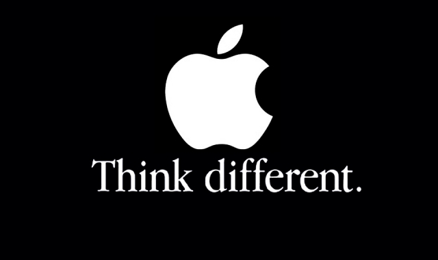
Monday, September 28, 2015

[p2]:4

Verdana

Verdana was created to address legibility of fonts on the screen. It was created by Matthew Carter. It's generous width and spacing make it extremely legible on screen. It comes with bold, regular, italics, and bold italics in it's font family. Tom Rickner also helped with font design. It was designed in 1996 and is owned by Microsoft. The type face can be classified as a humanistic sans serif. A case study done at Wichita State proved that people preferred Verdana as a the font used in web design. 


Sunday, September 27, 2015

[P2]:3

TYPE 1

This font was originally inspired by the way I draw my H's when I right "hello" which I actually write a lot. 

Inspiration: I found inspiration in retro styled fonts for this font.

Keywords: Retro, dynamic, sophisticated.

TYPE 2

This font was originally inspired by a font I saw while browsing around font struct (which I can't find anymore no matter how hard I look). I think it's pretty nifty. 

Inspiration:

Keywords: Construction-y, static, rigid.


But then...  I changed my mind and designed something totally different!


glimmer


Glimmer was inspired by these fonts:


Keywords: Bubbly, Feminine, Uneven

Bubbly- each letter contains a little addition that is like a gleam in a bubble, the letters are also very rounded and all closed in giving them a circular feel.

Feminine-  The letters are all very curved which rounded edges making them very soft and effeminate. 

Uneven- The don't contain a similar x-height giving them a funky and sort of adventurous uneven quality. 


Here is some work with castra in action


Sunday, September 20, 2015

[P2]: 2

Font Beginnings

To start developing my fonts I sort of just doodled on paper. I looked through the other fonts people made and then I started experimenting with what I could actually figure out how to make within the program.


[P2]:1

Garamond

Claude Garamond, the creator of Garamond, was a Paris type puncher in the 15th century and based a lot of his early fonts on fonts by Francesco Griffo. He spent his career developing type but it wasn't until after his death that the Garamond punches made it to the printing press. In 1691 Jean Jannon made a font extremely similar to Garamond which was popular for years and wrongly attributed to Claude. In 1900 Garamond was used to print the history of France which called a lot of attention to the typeface. The font family has been expanded immensely since its origins with Claude to include faces such as italics, and adobe.
Interesting Attributes: The small bowl at the end of the A and the E. Long top serifs with a downward slope. Considered to be among the easiest type faces to read. 
Key Word Attributes: Serif, Old Style, Rounded
Versions of Garamond can be found in these popular brand identities. 


Serifa

A slab serif front designed by Adrian Frutiger, was based off his early sans serif design, Univers. It was created in 1966. Frutiger was a Swiss type designer. Serifa has the linear skeleton of Univers but is more rounded at the edges, and obviously contains serifs. It is designed in many different weights. The type face was produced for the Bauer Foundation. 
Interesting Attributes: Uniform stem size (aka mostly the same thickness), bowl of the A round and extended. Thick serifs with square terminals. 
KeyWords: Slab Serif, Linear, Thick
Can be found in these places. 

Platlet

Originated from a four day design workshop at CalArts in 1992, created by mostly non-design students, attributions go to Conor Mangat. It was to be designed for outdoor use. It is directly based on California license plate font. 
Interesting Attributes: The stem of the B is an ascender. The L and J contain rounded descenders. The height of the Capital T appears to be equal to the X height. The counter in most of the letters are rounded off rectangles more often than circles (with the exception of the P). The stem of the E is completely rounded. 
Key Words: Sans serif, rounded, block text
Can be found in. 


Tuesday, September 8, 2015

[P1]: 4

Phase 2 Designs

Phase two designs were more fun than the previous phases because I felt like I had more freedom. That being said, working larger makes it difficult to keep all the text within the grid. 


Designers in History

Max Huber

Max Huber was a Swiss designer who helped lay the foundation of the Swiss school of graphic design, aka the type rules that we still learn today. Throughout his career he balanced his time as a freelancer and saving time for his experiments as he continued to create innovative designs. In his layouts he favored clarity, rhythm and synthesis placing a particular emphasis on hierarchy. His designs often explored photos and texts interwoven with blocks of bright colors.


Bruno Monguzzi

Bruno Monguzzi, another Swiss designer studied in both Switzerland and London. He began working in the design field in the early 60's, helping to shape some of the design of that time. He worked for Studio Bogorri, a famous European design firm, and ended up marrying the daughter of the owner. He lived by his axiom "form follows function." He spend a lot of his carreer designing posters and other typographic layouts all over Europe and eventually began teaching about typography in Lugano. He has won numerous awards for his designs as well as his educational work.

Emil Ruder

Emil Ruder, yet another Swiss designer, and worked with other notable designers to establish the Basel School of Design and played a key role in design in the 40s and 50s. He along with several others, including Armin Hofman, helped to formulate the Swiss design styles. Ruder taught that typographies main goal was to communicate ideas. He stressed the use of san-serif fonts and a clear concise style. He also placed an emphasis on the grid and an asymmetric style which is still used today. Ruder also wrote several books on type.


Piet Zwart

Another European designer, Piet Zwart also lead the charge in the modern type world. He believed that work that was done purely for the aesthetic would not stand the test of time, so he incorporated contemporary themes into his work. His work in particular contain constructivist inspirations. He like many other European designers, he designed on the grid and focused on asymmetrical styles. At the beginning of World War II, he was captured by the Germans. After being released he converted to mostly interior and furniture design. 

Paula Scher

Paula Scher is a designer stationed in New York. Her works focus predominately on environmental design with an emphasis in type. Scher makes type larger than life, while still conveying legible messages. She studied at Corcoran College of Art and Design and recieved the AIGA medal 2001. 

Jessica Welsh

Another designer based in New York, one of Forbe's 30 under 30, works on daring modern designs that include type. She has designed for clients like the New York Times, and Adobe, and currently teaches at the School of Visual Arts in NYC. She recently partnered with Sagmeister and they run a very excentric firm together. 
THIS IS MADE OUT OF PENCILS!


Tuesday, September 1, 2015

[P1]: T3

Here are my phase one computer layouts. Definitely enjoyed more than by hand layouts.


Adrian Frutiger is a famous type designer, who has designed some of the most well known typefaces. Born in 1928, he was the son of a weaver and studied in the traditional calligraphic ways of Europe at the time. Frutiger however did not follow the traditional styles though, and broke away from calligraphy to a more modern style of typography, a more legible word. He spent most of his career working for Deberny & Peignot updating and creating fonts but also worked on some of his own. Frutiger created 30+ fonts in his career, the most famous of which include Univers, Egyptienne, Serifa and Avenir. His type faces are known for being extremely versatile and having many different fonts in the family. Frutiger is heralded as one of the men who helped lay the ground work for digital type. He was won many awards from his innovative work, including The Gutenberg Prize, Medal of the Type Directors Club and Typography Award from SOTA. 


The Univers Grid


The Univers grid is a grid created by Frutiger to help designers establish when is the best time to use specific grid. The first number on the grid represents the fonts thickness, two being the thinnest and nine being the thickest. The second represents the width (kerning), two bring the most expanded and nine being the most pushed together. This grid is significant because it helps designers make a well educated choice about which font to use when and helps determine legibility with the fonts.