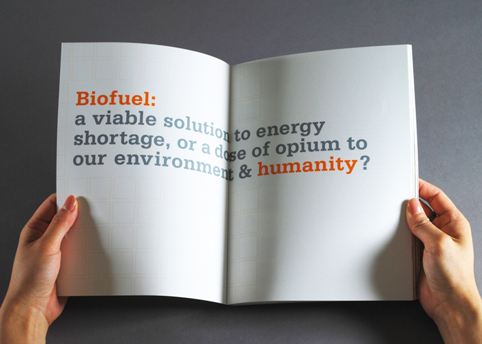
With a few minor tweaks I had my final. See the course blog for that.
Showing posts with label [P2]. Show all posts
Showing posts with label [P2]. Show all posts
Tuesday, October 13, 2015
[P2]:6
For my second trial of the mailer I had a lot better of a time. In class we discussed having a visual theme, and having gotten no good feedback on the last attempt I decided to redo the mailer. This time I focused on one of my key words: femininity. With that in mine I wanted each page to emulate the femininity and fun spirit I thought the font had.
[P2]:5
I started my mailer with really no idea what I was looking for. I tried to include all the different images and words I had begun for class but in all honesty I had no idea of a theme or where I wanted to be headed. I wasn't really sure what kind of liberties I could take so this phase was very experimental for me.
Monday, September 28, 2015
[p2]:4
Verdana
Verdana was created to address legibility of fonts on the screen. It was created by Matthew Carter. It's generous width and spacing make it extremely legible on screen. It comes with bold, regular, italics, and bold italics in it's font family. Tom Rickner also helped with font design. It was designed in 1996 and is owned by Microsoft. The type face can be classified as a humanistic sans serif. A case study done at Wichita State proved that people preferred Verdana as a the font used in web design.
Sunday, September 27, 2015
[P2]:3
TYPE 1
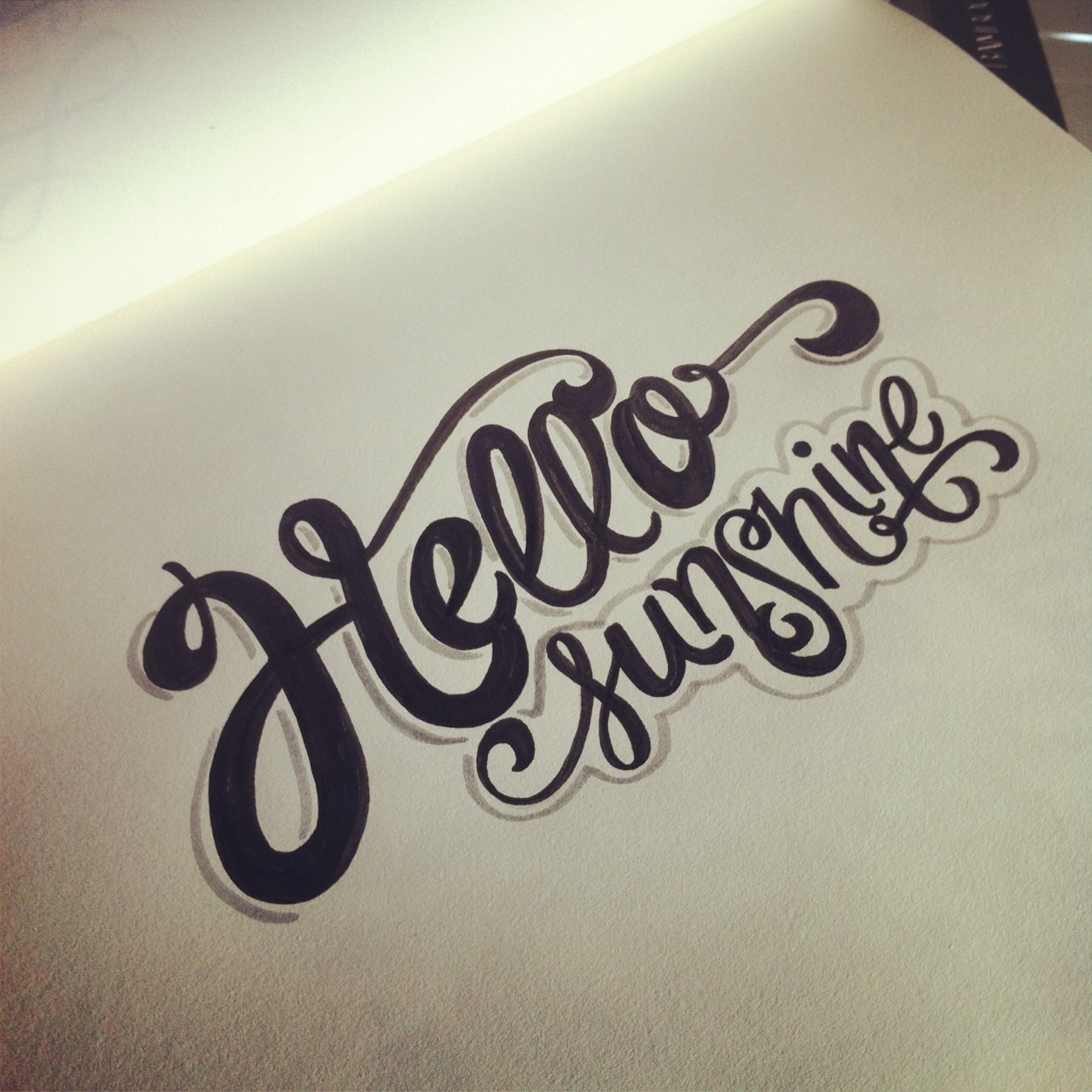
This font was originally inspired by the way I draw my H's when I right "hello" which I actually write a lot.
Inspiration: I found inspiration in retro styled fonts for this font.
Keywords: Retro, dynamic, sophisticated.
TYPE 2
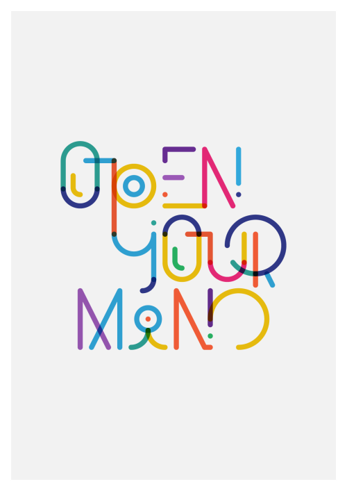
This font was originally inspired by a font I saw while browsing around font struct (which I can't find anymore no matter how hard I look). I think it's pretty nifty.
Inspiration:
Keywords: Construction-y, static, rigid.
But then... I changed my mind and designed something totally different!
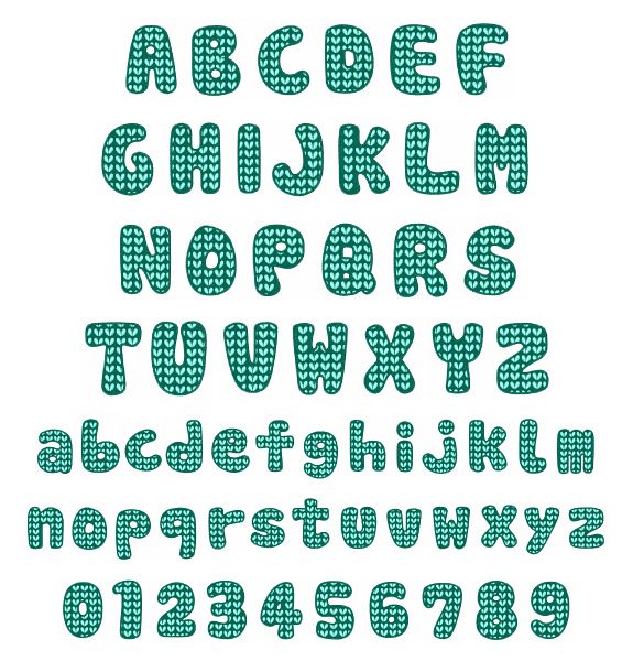
glimmer
Glimmer was inspired by these fonts:
Keywords: Bubbly, Feminine, Uneven
Bubbly- each letter contains a little addition that is like a gleam in a bubble, the letters are also very rounded and all closed in giving them a circular feel.
Feminine- The letters are all very curved which rounded edges making them very soft and effeminate.
Uneven- The don't contain a similar x-height giving them a funky and sort of adventurous uneven quality.
Here is some work with castra in action
Sunday, September 20, 2015
[P2]: 2
Font Beginnings
To start developing my fonts I sort of just doodled on paper. I looked through the other fonts people made and then I started experimenting with what I could actually figure out how to make within the program.[P2]:1
Garamond
Claude Garamond, the creator of Garamond, was a Paris type puncher in the 15th century and based a lot of his early fonts on fonts by Francesco Griffo. He spent his career developing type but it wasn't until after his death that the Garamond punches made it to the printing press. In 1691 Jean Jannon made a font extremely similar to Garamond which was popular for years and wrongly attributed to Claude. In 1900 Garamond was used to print the history of France which called a lot of attention to the typeface. The font family has been expanded immensely since its origins with Claude to include faces such as italics, and adobe.
Interesting Attributes: The small bowl at the end of the A and the E. Long top serifs with a downward slope. Considered to be among the easiest type faces to read.
Key Word Attributes: Serif, Old Style, Rounded
Versions of Garamond can be found in these popular brand identities.
Serifa
A slab serif front designed by Adrian Frutiger, was based off his early sans serif design, Univers. It was created in 1966. Frutiger was a Swiss type designer. Serifa has the linear skeleton of Univers but is more rounded at the edges, and obviously contains serifs. It is designed in many different weights. The type face was produced for the Bauer Foundation.
Interesting Attributes: Uniform stem size (aka mostly the same thickness), bowl of the A round and extended. Thick serifs with square terminals.
KeyWords: Slab Serif, Linear, Thick
Can be found in these places.
Platlet
Originated from a four day design workshop at CalArts in 1992, created by mostly non-design students, attributions go to Conor Mangat. It was to be designed for outdoor use. It is directly based on California license plate font.
Interesting Attributes: The stem of the B is an ascender. The L and J contain rounded descenders. The height of the Capital T appears to be equal to the X height. The counter in most of the letters are rounded off rectangles more often than circles (with the exception of the P). The stem of the E is completely rounded.
Key Words: Sans serif, rounded, block text
Can be found in.
Subscribe to:
Posts (Atom)


