Wednesday, December 9, 2015

Sunday, November 22, 2015

[P4]: 3

My computer work on logos


Here are the final three I edited down too.

I enjoy the top right one because it reminds me of a sun and Pheonix is very sunny. The second one is inspired by the desert layers. The last one is just fun.

[P4]: 2

Working on type things:


Monday, November 16, 2015

[P4]: 1


PHX Airport YAYYYYYYYYYYYYY


[P3]: 2

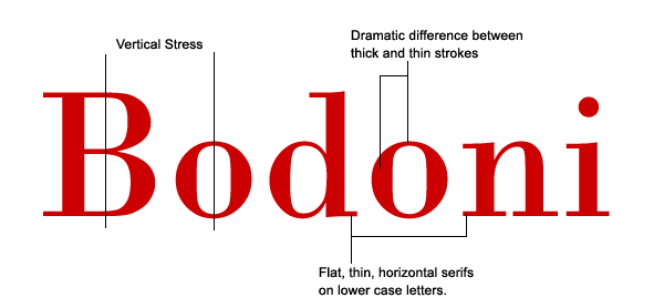
What are small capitals? How are they different than something set in ALL CAPS? Small caps are uppercase letterforms that are shorter in height than the capitals in a given typeface. When designed as part of a text face, they are most often the height of the lowercase (or very slightly taller), so that they harmonize with both the caps and the lowercase characters. 
-- Does your font have small caps? If not name a font that does. It doesn't. Sabon.
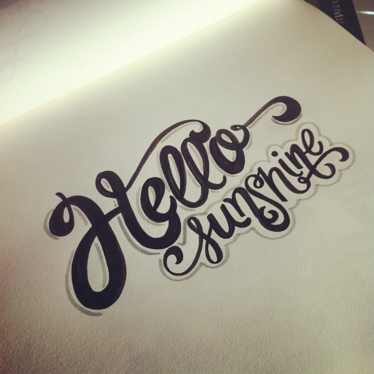
-- Ligatures? why are they used? when are they not used? what are common ligatures? Two or more letters are joined together to form one glyph or character. Definition: Two or more letters combined into one character make a ligature. Intypography some ligatures represent specific sounds or words such as the AE or æ diphthongligature.
-- Does your font have ligatures? If not name a font that does.Yes it does. They're kinda lame though....
-- Difference between a foot mark and an apostrophe? Footmarks are dumb quotes, they should only be used to mark a foot. An apostrophe is meant to separate a conjunction or the like. 
-- Difference between an inch mark and a quote mark (smart quote)? Inch marks are dumb quotes too. They are straight instead of curved and often used in place of quotes but they look really stupid. 
-- Hyphen, en dash and em dashes, what are the differences and when are they used.
Here is info I found about the when to use which
 I will try to condense the various bits of information scattered throughout CMOS. First of all, there are three lengths of what are all more or less dashes: hyphen (-), en dash (–), and em dash (—). I frame it this way because the work they do is roughly related to their length (though I don’t think CMOS puts it this way outright).
The hyphen connects two things that are intimately related, usually words that function together as a single concept or work together as a joint modifier (e.g., tie-in, toll-free call, two-thirds).
The en dash connects things that are related to each other by distance, as in the May–September issue of a magazine; it’s not a May-September issue, because June, July, and August are also ostensibly included in this range. And in fact en dashes specify any kind of range, which is why they properly appear in indexes when a range of pages is cited (e.g., 147–48). En dashes are also used to connect a prefix to a proper open compound: for example, pre–World War II. In that example, “pre” is connected to the open compound “World War II” and therefore has to do a little extra work (to bridge the space between the two words it modifies—space that cannot be besmirched by hyphens because “World War II” is a proper noun). Now, that is a rather fussy use of the en dash that many people ignore, preferring the hyphen.
The em dash has several uses. It allows, in a manner similar to parentheses, an additional thought to be added within a sentence by sort of breaking away from that sentence—as I’ve done here. Its use or misuse for this purpose is a matter of taste, and subject to the effect on the writer’s or reader’s “ear.” Em dashes also substitute for something missing. For example, in a bibliographic list, rather than repeating the same author over and over again, three consecutive em dashes (also known as a 3-em dash) stand in for the author’s name. In interrupted speech, one or two em dashes may be used: “I wasn’t trying to imply——” “Then just what were you trying to do?” Also, the em dash may serve as a sort of bullet point, as in this to-do list:
—wash the car
—walk the dog
—attempt to explain em and en dashes

This explanation is not intended to be exhaustive (for much more, see chapter 6 in CMOS 16), but I do hope that it helps to frame the different potential of each length of dash. 
http://www.chicagomanualofstyle.org/qanda/data/faq/topics/HyphensEnDashesEmDashes/faq0002.html
AND SOME PROCESS


Sunday, October 18, 2015

[P3]:1

Futura


FONT INFOIdentify the following information about your font
_ Sans Serif or Serif
_ Name of the Designer- Paul Renner
_ Other fonts the Designer has designed-
_ Date it was designed- 1924-1927
_ Classification (not just Sans Serif or Serif)- Geometric Linear Sans
_ List its family members: Roman, Italic, Bold...(small caps): light, light oblique, book, book oblique, medium, medium oblique, heavy, heavy oblique, bold, bold oblique, extra bold, and extra bold oblique


Old Style- serif fonts with a difference between thick and thin lines of font but not to striking. Based on calligraphy


Transitional


Modern- Large difference between thick and thin strokes.


Slab Serif- serif fonts with large square serifs.


Sans Serif- a font without the serifs at the ends


Stoke Weight-
the weight or thickness of the lines of a type face. 


Axis/Stress- the orientation on which a type face is placed. Ex: A titled axis would be an oblique font
Small Caps- an upper case version of a font with the same height as the lower case letters. 
Lining Figures- When the numbers in a font follow the baseline and height of the rest of the font.
Non-aligning figures- When the numbers dip above or below the x-height to distinguish numbers from text
Ligatures- When two fonts are specially designed in a type face because they are touching (ft, tt ect)


Tuesday, October 13, 2015

[P2]:6

For my second trial of the mailer I had a lot better of a time. In class we discussed having a visual theme, and having gotten no good feedback on the last attempt I decided to redo the mailer. This time I focused on one of my key words: femininity. With that in mine I wanted each page to emulate the femininity and fun spirit I thought the font had.


With a few minor tweaks I had my final. See the course blog for that.

[P2]:5

I started my mailer with really no idea what I was looking for. I tried to include all the different images and words I had begun for class but in all honesty I had no idea of a theme or where I wanted to be headed. I wasn't really sure what kind of liberties I could take so this phase was very experimental for me.


Monday, September 28, 2015

[p2]:4

Verdana

Verdana was created to address legibility of fonts on the screen. It was created by Matthew Carter. It's generous width and spacing make it extremely legible on screen. It comes with bold, regular, italics, and bold italics in it's font family. Tom Rickner also helped with font design. It was designed in 1996 and is owned by Microsoft. The type face can be classified as a humanistic sans serif. A case study done at Wichita State proved that people preferred Verdana as a the font used in web design. 


Sunday, September 27, 2015

[P2]:3

TYPE 1

This font was originally inspired by the way I draw my H's when I right "hello" which I actually write a lot. 

Inspiration: I found inspiration in retro styled fonts for this font.

Keywords: Retro, dynamic, sophisticated.

TYPE 2

This font was originally inspired by a font I saw while browsing around font struct (which I can't find anymore no matter how hard I look). I think it's pretty nifty. 

Inspiration:

Keywords: Construction-y, static, rigid.


But then...  I changed my mind and designed something totally different!


glimmer


Glimmer was inspired by these fonts:


Keywords: Bubbly, Feminine, Uneven

Bubbly- each letter contains a little addition that is like a gleam in a bubble, the letters are also very rounded and all closed in giving them a circular feel.

Feminine-  The letters are all very curved which rounded edges making them very soft and effeminate. 

Uneven- The don't contain a similar x-height giving them a funky and sort of adventurous uneven quality. 


Here is some work with castra in action