Here are my phase one computer layouts. Definitely enjoyed more than by hand layouts.
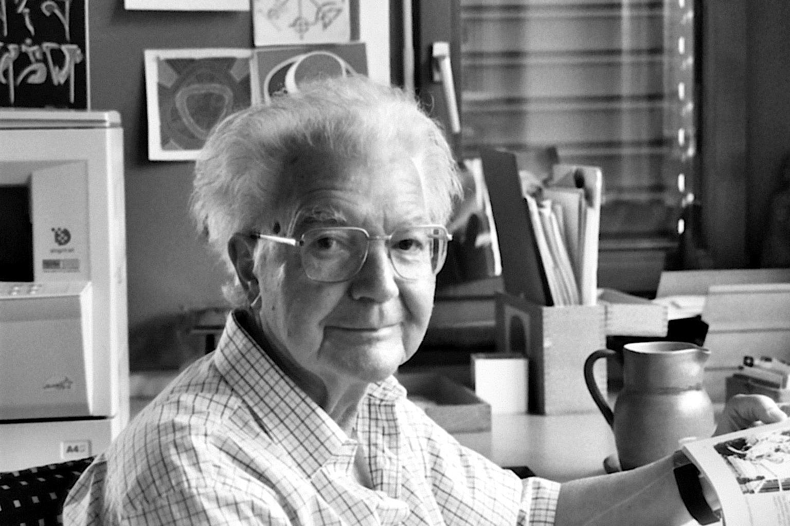
Adrian Frutiger is a famous type designer, who has designed some of the most well known typefaces. Born in 1928, he was the son of a weaver and studied in the traditional calligraphic ways of Europe at the time. Frutiger however did not follow the traditional styles though, and broke away from calligraphy to a more modern style of typography, a more legible word. He spent most of his career working for
Deberny & Peignot updating and creating fonts but also worked on some of his own. Frutiger created 30+ fonts in his career, the most famous of which include Univers, Egyptienne, Serifa and Avenir. His type faces are known for being extremely versatile and having many different fonts in the family. Frutiger is heralded as one of the men who helped lay the ground work for digital type. He was won many awards from his innovative work, including The Gutenberg Prize, Medal of the Type Directors Club and Typography Award from SOTA.
The Univers Grid
The Univers grid is a grid created by Frutiger to help designers establish when is the best time to use specific grid. The first number on the grid represents the fonts thickness, two being the thinnest and nine being the thickest. The second represents the width (kerning), two bring the most expanded and nine being the most pushed together. This grid is significant because it helps designers make a well educated choice about which font to use when and helps determine legibility with the fonts.


No comments:
Post a Comment