
TYPE 1
This font was originally inspired by the way I draw my H's when I right "hello" which I actually write a lot.

Inspiration: I found inspiration in retro styled fonts for this font.
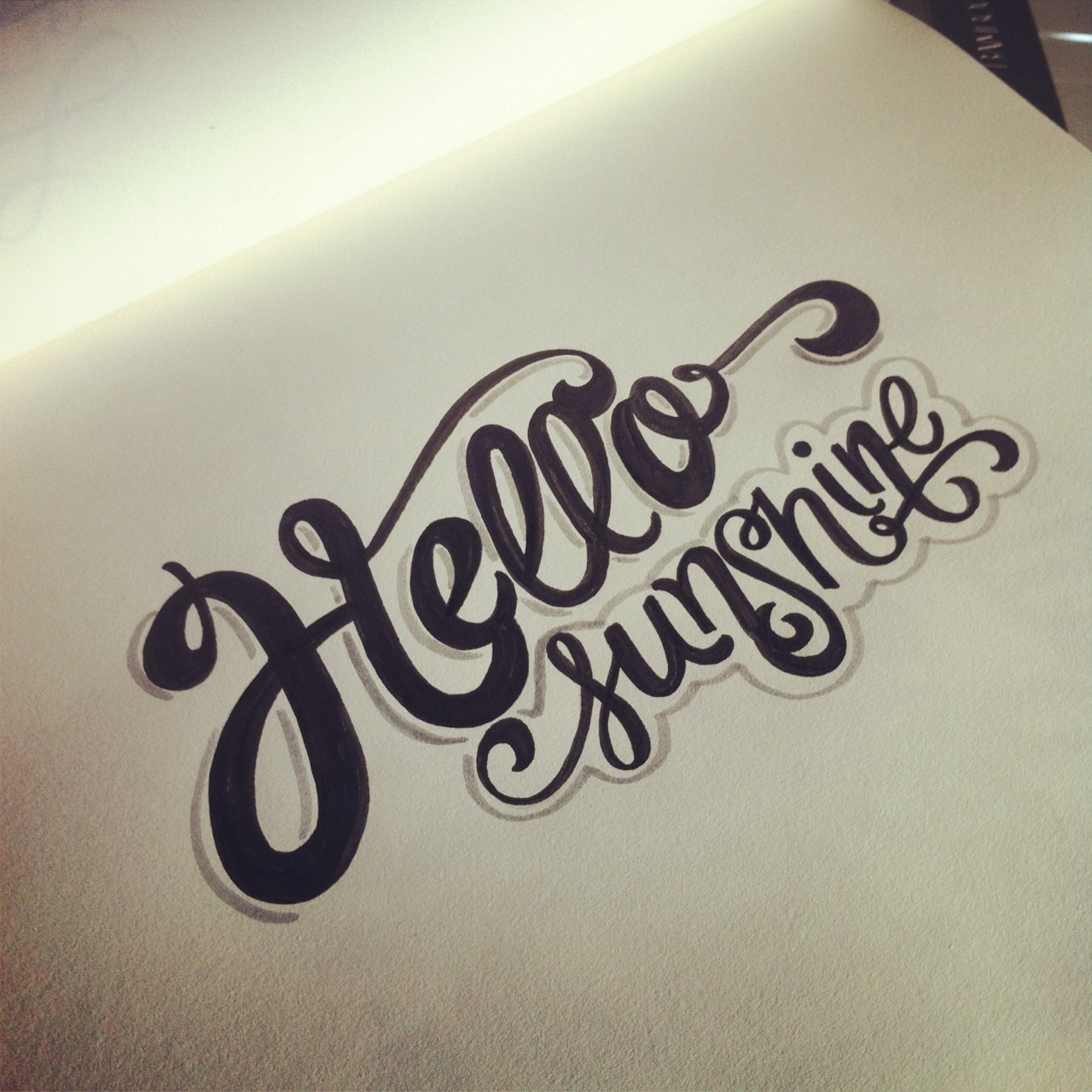

Keywords: Retro, dynamic, sophisticated.
TYPE 2
This font was originally inspired by a font I saw while browsing around font struct (which I can't find anymore no matter how hard I look). I think it's pretty nifty.

Inspiration:
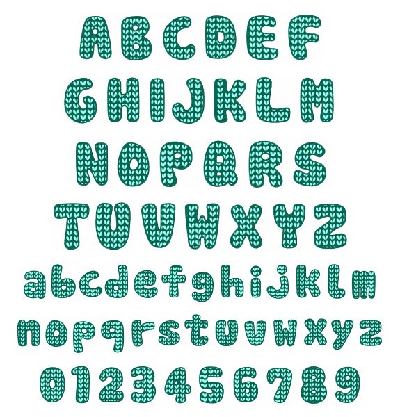

Keywords: Construction-y, static, rigid.
But then... I changed my mind and designed something totally different!
glimmer

Glimmer was inspired by these fonts:

Keywords: Bubbly, Feminine, Uneven
Bubbly- each letter contains a little addition that is like a gleam in a bubble, the letters are also very rounded and all closed in giving them a circular feel.
Feminine- The letters are all very curved which rounded edges making them very soft and effeminate.
Uneven- The don't contain a similar x-height giving them a funky and sort of adventurous uneven quality.


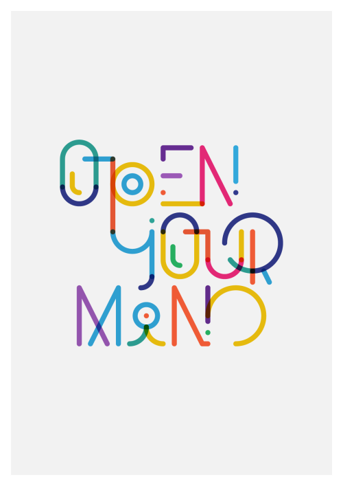
Here is some work with castra in action


No comments:
Post a Comment