
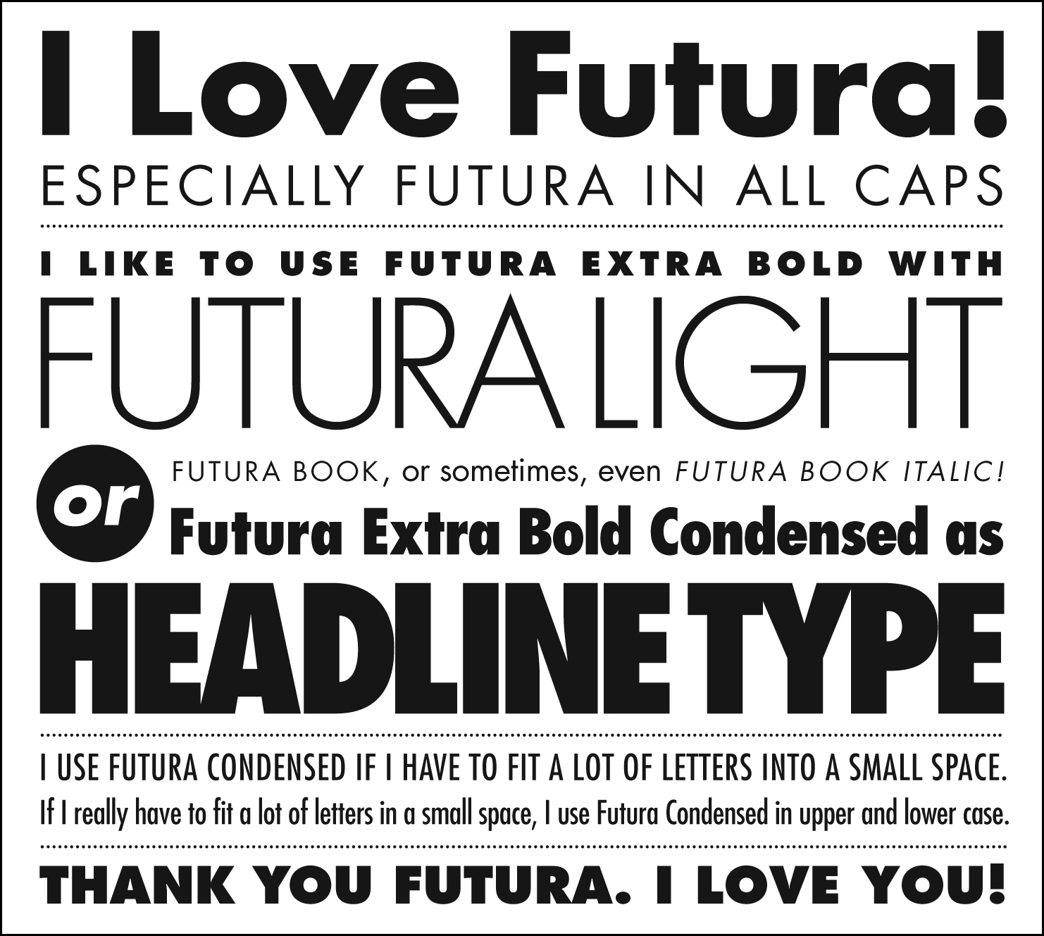
Futura
FONT INFOIdentify the following information about your font
_ Sans Serif or Serif
_ Name of the Designer- Paul Renner
_ Other fonts the Designer has designed-
_ Date it was designed- 1924-1927
_ Classification (not just Sans Serif or Serif)- Geometric Linear Sans
_ List its family members: Roman, Italic, Bold...(small caps): light, light oblique, book, book oblique, medium, medium oblique, heavy, heavy oblique, bold, bold oblique, extra bold, and extra bold oblique
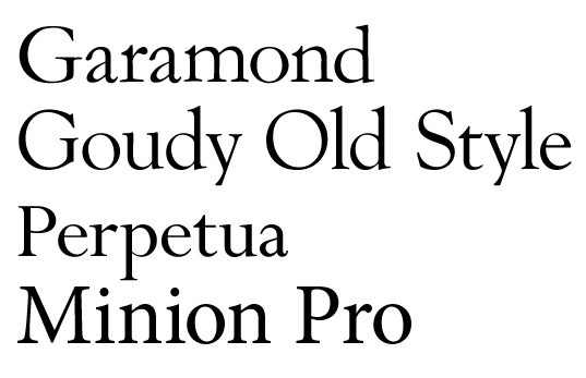
Old Style- serif fonts with a difference between thick and thin lines of font but not to striking. Based on calligraphy
Transitional
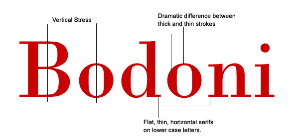
Modern- Large difference between thick and thin strokes.

Slab Serif- serif fonts with large square serifs.


 Sans Serif- a font without the serifs at the ends
Stoke Weight- the weight or thickness of the lines of a type face.
Axis/Stress- the orientation on which a type face is placed. Ex: A titled axis would be an oblique font
Small Caps- an upper case version of a font with the same height as the lower case letters.
Lining Figures- When the numbers in a font follow the baseline and height of the rest of the font.
Non-aligning figures- When the numbers dip above or below the x-height to distinguish numbers from text
Ligatures- When two fonts are specially designed in a type face because they are touching (ft, tt ect)

No comments:
Post a Comment